You can easily make a <div> element take up the full height of the browser window using CSS. This technique is useful for creating full-height sections or layouts in web pages.
#1. Using CSS Flexbox
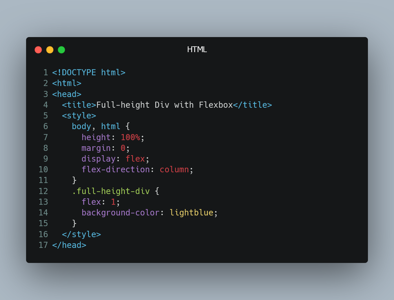
One of the simplest ways to achieve a <div> that occupies 100% of the browser window height is by using CSS Flexbox. Apply the following styles to the parent container and the <div> you want to make 100% height.
<!DOCTYPE html>
<html>
<head>
  <title>Full-height Div with Flexbox</title>
  <style>
    /* Set the parent container to a flex container */
    body, html {
      height: 100%;
      margin: 0;
      display: flex;
      flex-direction: column;
    }

    /* Make the target div take up all available space */
    .full-height-div {
      flex: 1;
      background-color: lightblue; /* Just for illustration */
    }
  </style>
</head>
<body>
  <div class="full-height-div">
    This div will take up 100% height of the browser window.
  </div>
</body>
</html>
In this example, we set the <body> and <html> elements to have a height of 100%, and we use display: flex; to create a flex container. The flex-direction: column; ensures that the child elements stack vertically. The <div> with the class .full-height-div is then set to flex: 1;, which makes it take up all available vertical space within the flex container, thus occupying the full height of the browser window.
#2. Using CSS Grid
Another method to achieve a full-height <div> is by using CSS Grid. Here's how you can do it:
<!DOCTYPE html>
<html>
<head>
  <title>Full-height Div with Grid</title>
  <style>
    /* Set the parent container to a grid container */
    body, html {
      height: 100%;
      margin: 0;
      display: grid;
    }

    /* Define the grid layout with one row that takes up all available space */
    body {
      grid-template-rows: 1fr;
    }

    /* Make the target div take up all available space */
    .full-height-div {
      background-color: lightblue; /* Just for illustration */
    }
  </style>
</head>
<body>
  <div class="full-height-div">
    This div will take up 100% height of the browser window using CSS Grid.
  </div>
</body>
</html>
In this example, we set the <body> and <html> elements to have a height of 100% and create a CSS Grid container by setting display: grid; on the <body>. We then define the grid layout using grid-template-rows: 1fr;, where fr stands for "fractional unit." This single row with a fraction of 1fr means it takes up all available vertical space.
The .full-height-div is a child of the grid container and will automatically occupy the full height of the browser window.
0 Comment

